Visualising our Labours
05 February 2008
Well it has been a mad few weeks. Between landing the new Get Add-ons pane, sheriffing the Firefox 3 beta 3 freeze, decimating old parts of the code and working through follow-up issues from the Get Add-ons pane and not to mention two 10 hour flights it really has been busy. Thankfully I’ve not just been totally buried under code, I’ve had some small spare time to tinker with a few other things (I need to to keep my sanity).
We’re getting better and better at adding quality control to our code. The QA team do their awesome work, we have some 50,000 automated unit tests now (depending how you count) and our tinderbox now has more machines running performance tests than it does machines building the Fox. One problem that all this brings though is a bit of information overload. The tinderbox is now so large that you can no longer glance to see if you can check in or not. Goodness knows how many pages you need to view to truly monitor all of the performance graphs. So, spurred on by Jonathan’s performance dashboard, I’ve been tinkering with some ways to present some of this data.
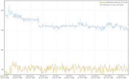
 . Unfortunately the graph kit I’m using seems a little slow and not all that functional, but that could be changed. Then again I have just found out that new work on the graphs server pretty much blows this out of the water!
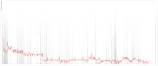
So that’s all pretty and good but doesn’t bring a much new to the table. Graphs are good but what we want to be able to do is relate the performance changes to the code that caused it. At this point Johnathan was kind enough to point me at Timeplot. This is a rather neat tool that lets you visualise numerical data on the same graph as defined events. That’s kinda perfect for this. It took me a little longer to hook this one up given the multiple sources and the kinda weird API that can’t normally load from anything other than a remote text file, but here is the result. You can see the performance data of course (Ts from the linux perf box), then each vertical band is a checkin which you can click on for more details.
 In the end the timeplot is not massively useful. When you get down to it we tend to check in far more frequently than we gather performance information. I’ll be interested to see if the fast run talos boxes will improve matters. If we had many of them then we can start correlating the regressions across them and thus far reduce the range in which to look for potential causes. I’m interested in other ideas people might have for visualising these kinds of data, I think finding the right way to visualise our information is the key to managing things in the future.
Another thing that needs help is the tinderbox of course. While I was in Mountain View last week Johnathan and I did a quick brainstorm of what the tinderbox is used for. We think it is being used for too many different things and if we split the display out into just those tasks that individuals needed then it would be far more manageable. Maybe you have your own comments on uses we didn’t come up with.
Just finally, after playing with timeplot I was still in a tinkering mood. One thing I periodically have to do is look back over what work I did on specific days. Bugmail is a good indicator for this. Now though I am working in my own Mercurial repository which means I have a full checkin log of my own to look over. Given that it is interleaved with the full Mozilla CVS checkin log it still a little arduous to scan through. But know I have the tools and after not long I can know skim over my previous checkins and even see in depth what each involved (yes, sorry boss it doesn’t look like I did much coding today!).